Is The UK Government Misleading The Public On COVID Tests? Tyler Durden Fri, 07/03/2020 - 06:20
Authored by Neil Lock via WattsUpWithThat.com,
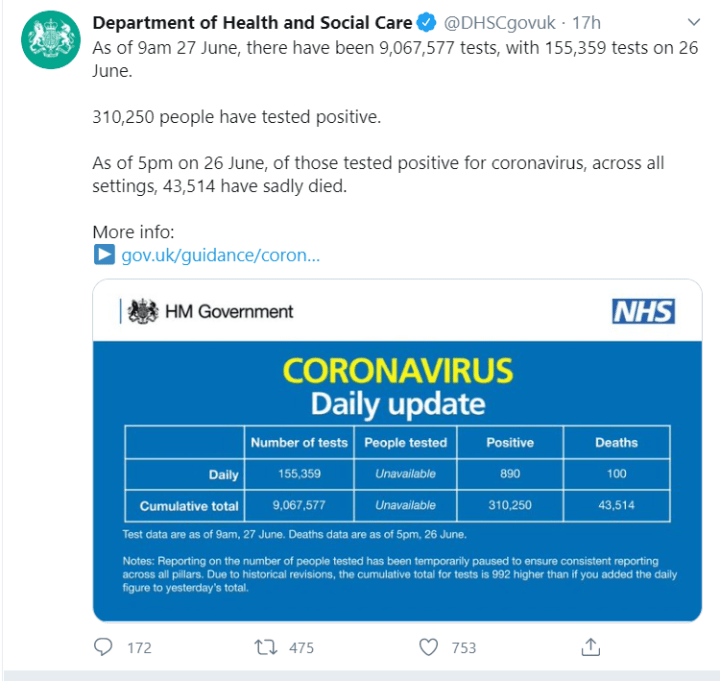
So, that’s over 9 million COVID tests done in the UK up to June 27th a.m. Sounds pretty impressive, doesn’t it?
As of today (July 1st), that count has moved on to 9,426,631 – fourth in the world in total tests! (The UK is also fourth in the world in COVID deaths per million population, and closing in on Andorra for third place; but that’s another story). Now… is that figure believable?
I recently wrote a paper about understanding the published statistics – deaths, cases, tests – on the effects of this virus around the world. It is very long, and a little bit technical – although it does include lots of pretty (and not so pretty) pictures! Those interested in the detail can find it here. I had a bit of a laugh when one commenter at “the world’s most viewed site on global warming and climate change” mentioned me (though, I must say, not totally approvingly) in the same breath as Judith Curry, who is a true climate-science expert!
In the course of writing it, I compared the two primary sources of world-wide statistics on this virus. One is worldometers.info. This is kept updated daily with data provided by the national health systems. The other, far more comprehensive because it includes historical daily data from the beginning of the epidemic, is Our World in Data. I used Our World in Data.
I found some interesting discrepancies between the two. One was with the Swedish cases numbers – a political hot potato, because of the lack of lockdown in Sweden. With the help of a Swedish commenter at WattsUpWithThat, I found that the issue seems to arise because the Swedes allocate each positive test to the date the test was done, whereas Our World in Data (whose data, if I understand right, comes via the World Health Organization) allocates each positive test to the date the test was reported, which is often days or even weeks later.
More concerning, though, was the UK’s data on numbers of tests carried out. Now for the UK, new cases and deaths reported by Worldometers and Our World in Data are in sync, with Worldometers always one day ahead. That’s consistent with the idea that Our World in Data gets its feed via a third party. The UK does report tests on a daily basis, but there’s often a gap of three or four days before a particular day’s tests appear at Our World in Data.
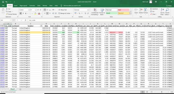
So… the daily Twitter update, shown at the head, gives the numbers of new cases and deaths on the day in question as 890 and 100 respectively. I’d expect those two numbers to appear in Our World in Data against the following day, June 28th. And indeed, they do:
But what about those numbers of tests? 4,852,547 is the cumulative total recorded here, against the 9,067,577 stated in the Twitter feed. This means the total reported on the Twitter feed was 87% greater than – i.e. almost twice – the “official” figure which, if I understand right, must have been reported to the WHO. That’s an awful lot of missing test kits!
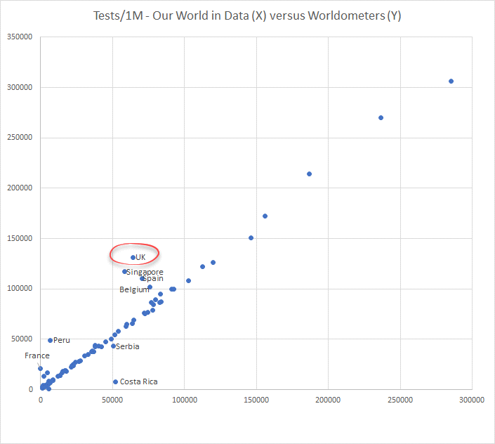
Is such a discrepancy normal? To answer that question, I compared the UK with other countries. I took the cumulative total numbers of tests per million population reported at Worldometers up to June 23rd, and compared these with the numbers reported at Our World in Data up to June 26th. I had no expectation that the numbers would match anywhere near exactly. Indeed, what I found is that the Worldometers numbers were consistently above the Our World in Data ones, in most cases by between 1% and 18%. This seems reasonable to me, given that testing is still ramping up in many countries, and the Worldometers count will probably include situations such as test kits sent out but not yet returned.
I then plotted the numbers of tests per million from the two data sources on a scatterplot:
The plot thickens! The UK shows by far the biggest discrepancy in absolute terms among all the countries, and as a ratio it is only surpassed by Peru and France (and the French are not providing any meaningful data on tests at all). Of the three other “bad boys,” two, Belgium and Spain, are also among the countries hardest hit by the virus. Exactly the places, where you would expect there to be most political pressure to make the numbers look good!
Even the BBC seem to think all is not well on the subject of COVID testing in the UK. It looks as if one problem is that antibody tests are being counted along with the swab tests, thus making the ratio of positives to tests lower than it ought to be. Also, they are counting test kits that have been sent out, many of which may never be returned. Moreover, the Chairman of the UK Statistics Authority, Sir David Norgrove, wrote to the government a month ago. He said, among much else:
“The aim seems to be to show the largest possible number of tests, even at the expense of understanding.”
And one thing more. As I discovered while writing my article, the UK’s statistics collectors were recently required to move from their original basis of counting people tested to counting tests performed instead. This, obviously, resulted in increases in the headline numbers of tests right through the course of the epidemic. It also, unfortunately, meant that all the daily numbers of tests done in the UK prior to April 26th got wiped. And, while this move did bring the UK more into line with many other countries’ reporting procedures, countries such as Canada, Japan and the Netherlands are still reporting by people tested. So, my guess is that this move (likely both difficult and expensive), the over-reporting of test numbers, and the poor presentation of the data that Sir David criticizes, have all come about because of political pressure from those who want the numbers to look as good as possible. Sigh.
So, is the UK government misleading the public on COVID tests? Sir David Norgrove obviously thinks so; and I agree with him.
https://ift.tt/2BZvOBO
from ZeroHedge News https://ift.tt/2BZvOBO
via IFTTT


0 comments
Post a Comment