The Good, The Bad, & The Ugly
Authored by Sven Henrich via NorthmanTrader.com,
“Sometimes I wonder if the world is being run by smart people who are putting us on or by imbeciles who really mean it”
– Laurence Peter
After months and months of sticking to a transitory narrative despite ever rising inflation data Jay Powell finally caved yesterday and retired the word transitory. What a colossal embarrassing blunder. Once again a Fed Chair being in total denial about reality. Like Ben Bernanke in 2007 declaring subprime contained and not a threat to the economy, persistent inflation is suddenly a risk to the economy when it supposedly wasn’t all year long while the data clearly kept saying that it was.
The Fed not only got inflation wrong but by extension they got policy completely wrong and I find myself very much validated here: They’ve totally overdone it on the liquidity front as they kept printing like mad men into an inflationary environment that they denied existed. And it’s not only the Fed. Combined with the ECB both central banks have added a combined $3 trillion in liquidity just in 2021 into an inflationary environment no less. Mad. Which means they exacerbated a massive asset bubble exacerbating wealth inequality when the right policy should have been to taper sooner. And now they may be forced to slam the foot on the breaks, a point I made on CNBC today:
Glad to join @CNBCTechCheck today.
— Sven Henrich (@NorthmanTrader) December 1, 2021
Here's part of the clip.
We never got to the charts, but I'll aim to post some additional commentary which will include some charts. https://t.co/SUOdfk3wLM
What’s this all mean for markets in the here and now? Since I promised some charts let me give you the good, the bad, and the ugly.
Let’s start with the good:
Let’s recap key technical developments as the context of the market action in oh so important. In late October I highlighted the case for “Make Bears Cry” the infamous broken trend and then new highs to retest the broken trend which was first identified in late September. Bears did indeed cry as everything broke out to new highs including aggressive rallies in small caps, the $NYSE, $DJIA and $SPX and $NDX of course.
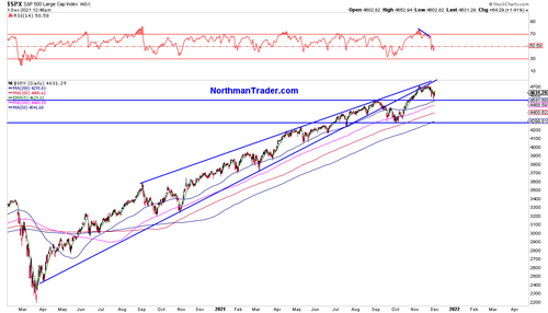
On November 16th in the NorthCast I outlined an inverse pattern on $SPX with the technical target of 4740. This target not only got hit rather precisely but it served as a key reversal pivot again off of the trend line we’ve been watching all year long:
Note how stubborn and persistently $SPX keep tagging the trend line from the underside with the final highs coming on a very pronounced negative divergence.
As the sell off ensued I highlighted in MarketWatch the September highs, i.e. the 4550 zone, as a key price zone bulls must hold to continue to be constructive for year end. This level was almost reached yesterday and has so far held as support. But watch this price zone closely in the days and weeks ahead, for should bulls lose this zone things may get a lot uglier still.
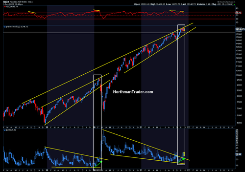
Note the same applies to $NDX:
Whereas $SPX has broken its trend in September, the $NDX trend remains intact and the index has remained incredibly resilient. As long as the trend remains intact tech is in a good position to set up for a year end rally. $NDX also remains above the September highs and as long as these previous highs hold as support the price action can be constructive as a back test. Note also how precise the trend has remained both on the resistance as well as the support side in the past year:
Now to the bad:
Note in the chart above the $VXN, the underlying volatility index, has broken out and in the lead up to the November highs it kept warning with rising volatility prices, that’s the same event we saw leading up to the February 2020 top.
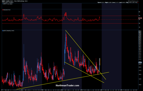
We can observe a similar even more pronounced breakout in $VIX a pattern that held its uptrend throughout 2021 which I again highlighted in “Make Bears Cry”:
While bulls can hope to compress the $VIX again for a backtest into late December the genie looks very much to be out of the bottle.
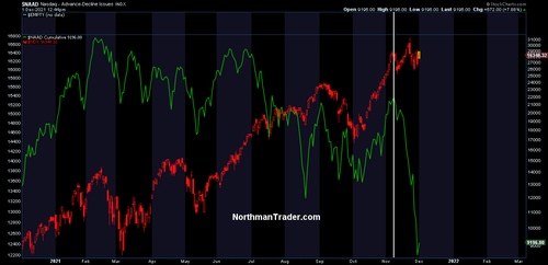
Another big issue is that ever more highs in $NDX this year have come on an ever weakening cumulative advance/decline picture and in recent days in particular that indicator has completely fallen off the cliff:
This again speaks to the narrowing of leadership of a few stocks that are holding up the index. Note the advance/decline was falling off the cliff even as $NDX made new all time highs on November 22. Indeed the intermittent peak was in early November way before Omicron was even identified. To highlight the extent of the damage beneath: The average Nasdaq component has experienced a 41% drawdown in 2021, 19% on the $SPX. So while we all get the impression of a massive bull market the underlying picture is not so pretty. The everything rally which sees many stocks getting hammered.
Which brings me to the ugly.
In the lead up to the November 22 highs on $SPX and $NDX many other indices did not follow suit as tech was leading driven by a few stocks. This is precisely the same development we saw in January 2020 going into February 2020.
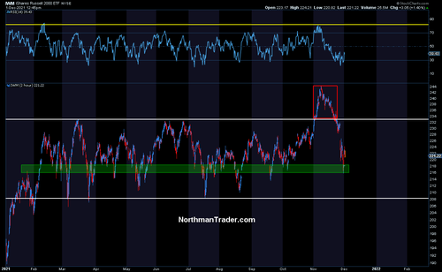
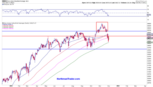
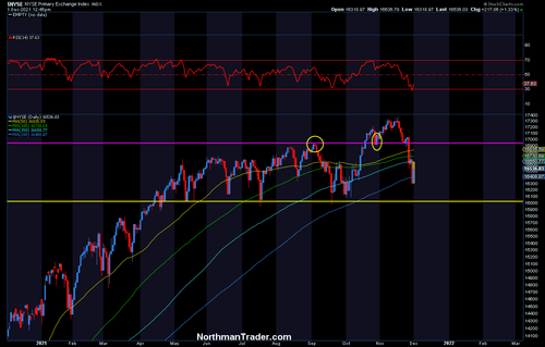
Indeed, the September high backtest support I mentioned in $NDX has already broken in many indices, such as the $DJIA the broader $NYSE and also small caps which just got pounded dropping 12% in just 3 weeks one of the most aggressive drops from all time highs in history:
Indeed 2 out of the 3 previous similar sizable sell offs of this magnitude from all time highs came in March 2020 and in August 2007 just as the asset bubbles began to crack.
The key issue: Trapped supply above as many traders chased the breakout and are now finding themselves under water. Note $IWM is back at February levels.
And this same trapped supply issue with failed breakouts can be observed in the $DJIA and the broader $NYSE:
What all of these charts highlight is that there has been tremendous corrective damage inflicted in individual stocks far beyond what the main indices indicate.
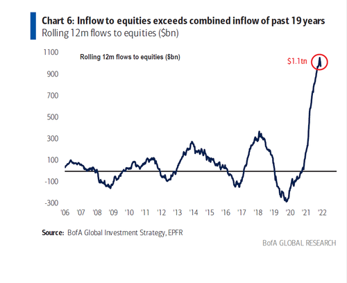
And unless everybody owns only $SPX and $NDX index funds and only the winning stocks it appears people have gotten hammered hard somewhere in individual stock holdings. A question arises. If everybody has piled into stocks like never before:
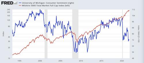
Why are so many unhappy?
Consumer sentiment per University of Michigan shows levels commensurate with the March 2020 crash lows. Both can’t be true. So there’s something big time amiss here. And unless all the inflows are in the winning stocks only there is pain out there that is masked by the indices.
Unhappy consumers are not happy voters and this has to be a concern for Democrats going into mid term elections next year.
And it is consumers that have been hit the hardest by rising inflation exacerbated by the Fed’s reckless printing:
Powell retiring transitory today is an admission that the Fed has been running the wrong monetary policy since at least the spring & the bottom 50% have been paying the price while the Fed has continued to bloat up the net worth of the top 1%.
— Sven Henrich (@NorthmanTrader) November 30, 2021
And this deserves a renomination 🤦♂️
None of this does not preclude a Santa rally from oversold conditions still, but as we saw in early 2020, massive divergences in index performances leading up to new highs are a major warning sign, and the underlying volatility components in all of these charts, including the $VIX, show breakouts suggesting the genie is out of the bottle and will make for a much more volatile 2022.
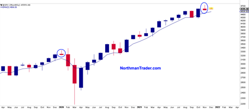
Indeed I could even point to similar monthly candle in November as we saw in January 2020:
Back then the initial news of a new virus was very much ignored and $SPX and $NDX went onto new highs while financials and small caps did not. Sound familiar?
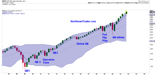
I’m not making a crash call here, but it may serve to remind the the S&P 500, despite the recent pullback, remains above its quarterly Bollinger band and remains far disconnected from even a basic quarterly 5 EMA reconnect:
Periods of excessive printing have seen such disconnects before, but the reconnect is coming, either this quarter or likely during the next quarter.
While in all of history this Bollinger band was resistance, the liquidity excess of 2020 and 2021 has turned this Bollinger band into support. How long this historical aberration continues very much depends on artificial liquidity injections continuing. The short term good news for bulls may be also this historical fact: Since 20009 all major corrections did not manifest themselves until QE programs were ended and corrections were ended with more liquidity coming in. In this sense it may be argued that the first larger correction will not come until the Fed actually ends QE.
But then we’ve never seen such a price and valuation disconnect from the underlying economy in history while we see the Fed’s credibility suddenly very much shaken. After all it’s all about confidence.
* * *
For the latest public analysis please visit NorthmanTrader and the NorthCast. To subscribe to our directional market analysis please visit Services.
https://ift.tt/3lr5HI2
from ZeroHedge News https://ift.tt/3lr5HI2
via IFTTT




0 comments
Post a Comment